Magazine layout design: the fourth spread
(InDesign: go to the fourth interior page spread in the magazine to follow along with this example.)
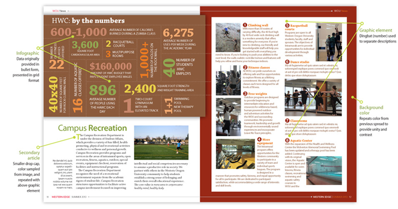
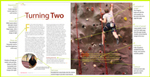
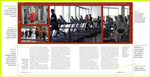
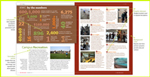
For this spread we've placed the supporting text on the righthand page, which features different locations within the Wellness Center. We've added another dingbat character for numbering each photo and corresponding text. Images for each paragraph have been placed, with a text wrap around each. We'll also drop an infographic (top half of left page) to highlight some additional quick facts about the center. This graphic was also created in InDesign, colors taken from swatches sampled from the main rock wall image on the first spread.
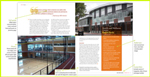
Finally, we've included a secondary article placed below the infographic, which highlights outdoor recreational opportunities. The photo caption for the image of the artificial turf field that accompanies this secondary article follows the layout design of the previous page spreads; placed in the far left hand column at the bottom of the page, text aligned to the right. Placing the photo at the top right side of the article provides balance, helped the white space to the far left above the photo caption.
Next: go to Setting up the document