Setting up the document: choosing a color palette
(InDesign: go to the first interior page spread in the magazine to follow along with this example.)
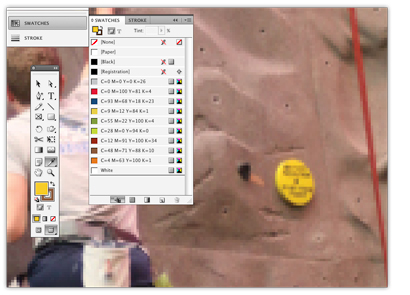
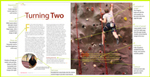
For this article, colors were sampled from the rock wall image to use throughout the page spreads. Using the eye dropper tool located in the tool bar at the left, hover your mouse over any areas of the image you'd like to sample. That color will appear in the Fill area of the toolbar. You may need to zoom in on the image to more closely see the variations in color.
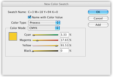
When you're satisfied with the color you see, open the Swatches panel. Click on the top far right button and select New Fill Color. This will open a new window, called New Color Swatch. This will usually default to the RGB colorspace. Be sure to change the color mode to CMYK, as this magazine is planned for printing. You can either leave the Swatch Name to default of the color values, or uncheck the Name with Color Value box, and you will be able to type in a name that might make more sense to you. Repeat as needed to create your final palette.
Keep the Color Type to Process, unless you plan on adding a spot color. You will need to know in advance if your budget will allow for more than the traditional four-color process printing.
Next: Selecting fonts for the body and article subheads