Extra elements: designing pull quotes
(InDesign: go to the second interior page spread in the magazine to follow along with this example.)
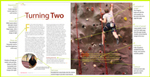
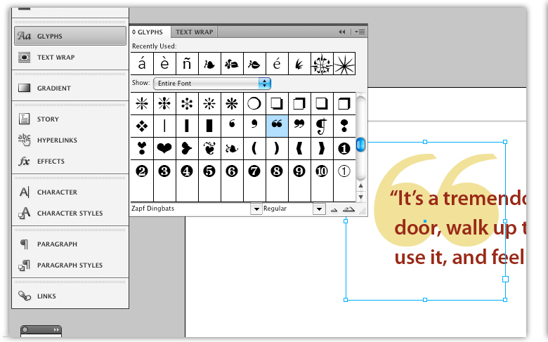
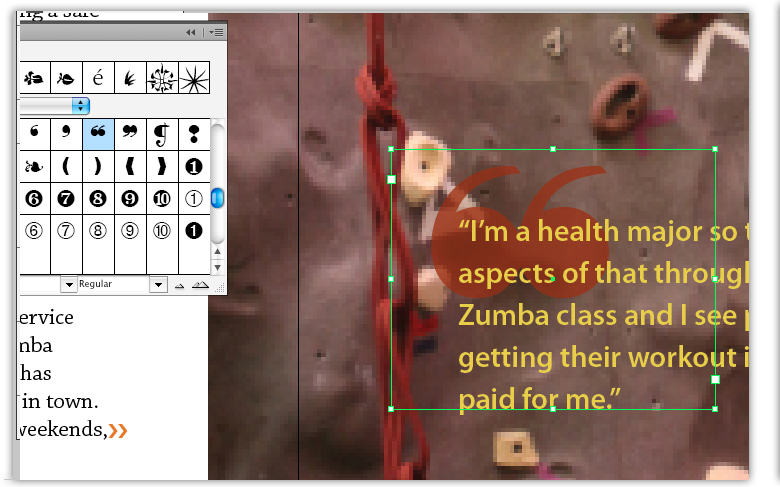
A pull quote is a great way to break up the monotony of large sections of text. Ideally, the pull quote should occur on the same page as it appears in the body of the text, but it's not always necessary. I added an oversized left quotation mark for fun - using a dingbat from the Zapf family, and placed it behind the quote. I used a tint of the color swatches, and reversed the colors for each of these. To place the "big" quotation mark, select your text too, and drag on the page to create a text frame. Make sure Zapf Dingbats has been selected, click on the Glyphs to open the dialog box, and double click on the double left quotation mark.
Side note: If you look closely at the two images, you'll see that I forgot to apply the "Optical Margin Alignment" feature to the quotation itself in the example on the right. In the quote on the left image, the "I," "d" and "u" in the first three lines align themselves (to the left) on top of one another, and the small quotation marks sits just outside the left edge of the paragraph. In the image at right, that step was not taken, and the first letter is sitting to the right of the visual left side margin (See Creating paragraph styles). These kind of differences may seem small, but to the experienced designer (and to his or her editor), those details matter. And your final product will look more polished as a result.
Next: Avoid leaving widows and orphans behind (good practice for page layout design, too...)