Magazine layout design: the first spread
(InDesign: go to the first interior page spread in the magazine to follow along with this example.)
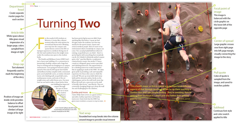
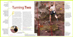
In this first spread for this multi-page article, we've placed a full-page photo to the far right, which spans over the center margin. This helps to visually connect the body copy with the image. We've also placed a small image, set inside a circle to the far left of the first page. This smaller image, combined with the placement and size of the title and the focal point of the student climbing the rock wall, creates a subtle "triangle" for the eye to follow, and helps create a sense of balance for this spread. The pull quote superimposed over the large image picks up colors from the image, and those colors helped form the color palette that is repeated throughout the story.
Next: go to Spread #2