Extra elements: adding supporting text or graphic elements
(InDesign: go to the last page spread in the magazine to follow along with this example.)
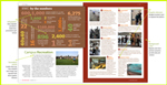
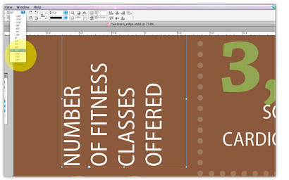 This infographic is simply text (rotated 90 degrees in some cases) and dotted lines (strokes). After copying the text from a Word file and pasting onto the page (option: File > Place > select the Word doc), separate the sections into separate text boxes. After some trial and error, this infographic took shape. Use the color swatches (created previously, Choosing a color palette) vary the colors and sizes of the corresponding numbers and facts.
To rotate some of the facts for visual interest (and fun), select the text boxes with the direct selection tool - the black arrow - and you'll find a section at the top tool box next to the rotation circle graphics. From there you can select an exact number, or type in your own. You can also go to the small tool box on the side, and select the free rotation button (same circle arrow graphic as on the top tool area), and by holding down the Shift key, you can control the rotation to increments of 15 degrees. Add a color field background to set the information apart from the article. Use the Shape graphic in the small tool box - the default is a rectangle. Drag the shape onto the page, you can resize as needed to fit the final content. Select the black arrow, and mouse over to one of the edges (or corner) of the shape, and adjust accordingly. Leave a "comfortable" looking area on all four edges to maintain consistency.
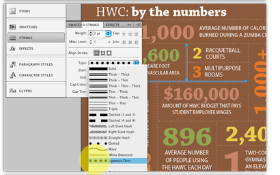 Finally, dotted lines were added to separate the bits of information, again repeating the circle shape used in some way on each spread. First, create a line with the line tool from the text box, repeat as needed to fill in the infographic sections. You can re-size each line with the black arrow, or you go to the top tool box and type in an exact number at the "L:" prompt. (If you have a shape or image selected, the L will change to two options, W and H, in order to adjust the width and heighth of the object.)
To change the default solid line setting of the stroke, go to Stroke > Type, and scroll down for the options. In this instance, the Japanese Dots were used for this particular graphic. You can also adjust the line's weight in this same pane.
Next: Add continuing and ending characters for more visual cues.