Working with text: selecting the fonts
(InDesign: go to the first interior page spread in the magazine to follow along with this example.)
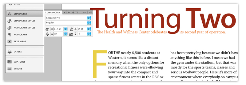
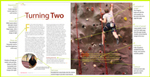
For this magazine, a serif font has been used for the body copy, and a san serif for the subheads, title and pull quotes. Chapparal Pro was selected for the body. Pro fonts come with a wide assortment of weight and style options - in this particular font there are more than 30 options, from Light, Light Italic, Regular, Condensed, Semi Condensed, Bold, Bold Condensed, etc. For visual contrast Myriad Pro, a san serif font, is used for the title, subheads and captions throughout the page spreads.
These fonts are both an OpenType® Face, which is the type of font preferred by printers (sheet fed and web press) and designers. These fonts provide extensive language support and advanced typography options. "OpenType® is a cross-platform font file format developed jointly by Adobe and Microsoft. Adobe has converted the entire Adobe Type Library into this format ... Because of the limitations of previous font technologies, support for expert character sets and multiple languages required separate font files. OpenType® fonts provide far more typographic capabilities by combining base character sets, expert sets, and extensive additional glyphs into one file." http://www.adobe.com/products/type/opentype.html
For the graphic design historian/enthusiast: both fonts were designed by Carole Twombly, an American calligrapher who worked for Adobe Systems in the 1990s. http://en.wikipedia.org/wiki/Carol_Twombly