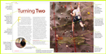
Working with text: flowing text from page to page
(InDesign: go to the third interior page spread in the magazine to follow along with this example.)
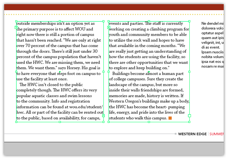
Ideally, all your text for the main article would be created from one initial text frame, with new frames created as you drag your mouse to the next column, and drop the extra text into it.
You'll notice small arrows on the left and right edges of the column: on the upper left the arrow indicates the text is being continued from a previous column. The arrow to the bottom of the right side of the frame indicates that text is being continued onto another text frame.
When there is no more text to display, a small box will take the place of the arrow on the lower right corner of the text frame. All of the frames are adjustable with the selection tool (black arrow) and can be shortened or lengthened as needed for your layout.
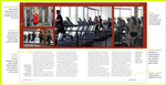
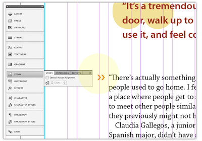
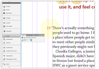
Finessing the text (using optical margin alignment)
This is a frequently overlooked tool in page layout design. The difference may be subtle, but your finished piece will look even betterif you use this feature. You'll find the Optical Margin Alignment option located in the Story panel. This feature" pushes" the punctuation marks (such as quotation marks) outside of the margin, causing the text to line up more uniformly at the left side edge of the column. The images below show a close-up example of the optical margin alignment turned "off" in the left image, and "on" in the right image. Look at the placement of the capital "T" at the beginning of the paragraph. Try zooming out on the pages on your InDesign docoument, and watch the difference it makes by toggling back and forth with the option checked and unchecked. It affects all types of punctuation marks, including commas and hyphens.
Next: applying hyphenation (or not) to your story