Setting up the document: margins and columns
(InDesign: go to the first interior page spread in the magazine to follow along with this example.)
 This particular layout has what appears to be three columns, two wide columns for the body of the text, and narrow columns at the outside of each page for the captions, and white space. You could choose three, four or five columns, there is quite a bit of flexibility in page layout design.
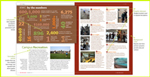
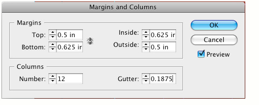
InDesign will only let you set up columns uniformly, divisibly equally across the page. In order to create this assymetrical look, choosing 12 columns gives you that flexibility to arrange the columns in various widths. The image below shows the underlying structure of the spreads. To set up the margins and columns, go to Layout > Pages > Margins and Columns. Set the margins for all four edges - top, bottom, inside and outside - as well as the number of columns and the gutter (the space between the columns.)
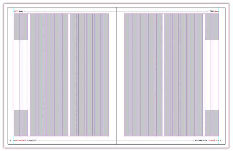
There is no wrong or right choice here - many magazines will allow for completely different column widths in the same issue. What will usually stay consistent are the margins along the edges, where you commonly find the page numbers, and magazine titles and issue month or number. Most readers expect that kind of consistency, even when the subject matter of each article may be completely unrelated to one another.
Next: Create master pages for those elements common to every page