Magazine layout design: the second spread
(InDesign: go to the second interior page spread in the magazine to follow along with this example.)
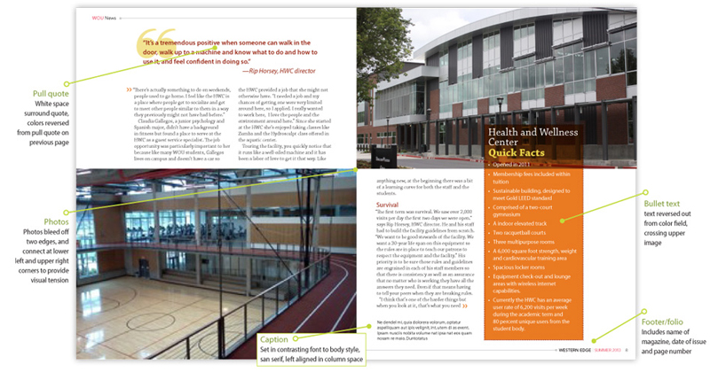
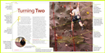
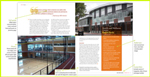
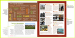
In this page spread, two large images are placed at the lower left and top right, and both images bleed off two edges, but meet at the center spread, without bleeding into the interior margin. The point at which they meet adds some visual tension. A section for quick facts has been placed on a column with a color background. You'll learn another effects technique often used by designers - applying the "multiply" feature to the color area causes it to blend that color with the photo behind it. The content of the large photo on the left page - the diagonal lines of the elevated track - help pull the eye into the spread. The same is true for the more subtle diagonal lines of the upper image, drawing the eye down and into the spread. You may also have noticed that the pull quotes feature an oversized quotation mark (another glyph element from the Zapf dingbat font family) that mimics the "circle" element repeated intentionally throughout the article.
Next: go to Spread #3