Magazine layout design: the third spread
(InDesign: go to the third interior page spread in the magazine to follow along with this example.)
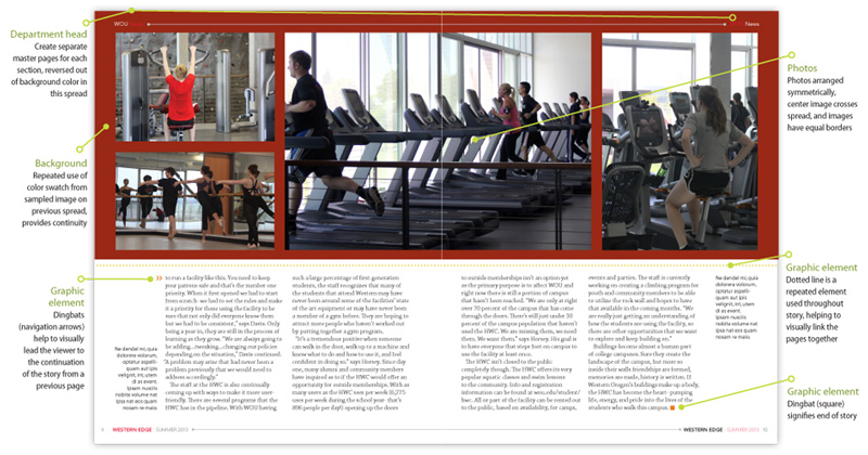
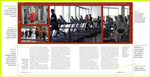
In this section of the article, we've placed the images in a grid-like structure across the top of the text. Instead of bleeding the images off the edge of the pages, the color used for the article's title was used to add a "punch" of color to the spread. A horizontal dotted line treatment was added just below the images, which picks up the color also used on the main title page, for the subtitle of the article. This element repeats the cicle theme (the photo inset on the first page, plus some of the shapes from the rockwall). The dotted lines are also a repeated element used for the infographic on the final spread of the article.
Next: go to Spread #4