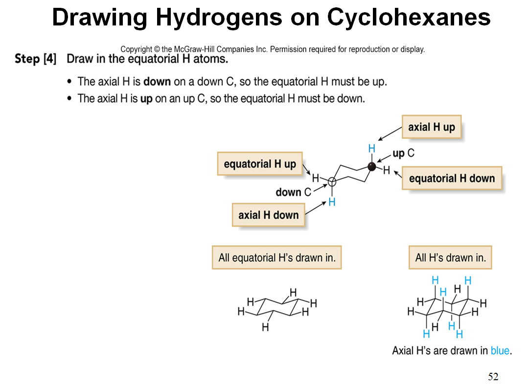
PowerPoint presentations are frequently referred to as “death by PowerPoint” because often the slides are crammed with paragraphs of words or lists of bullet points. The slides that come with textbooks are often perfect examples of what I believe should not be used in a classroom lecture. For example, here are the two consecutive presentation slides that come with the text that I use in my organic chemistry class. They are a copy of a figure from the text book outlining how one draws the chair form of a cyclohexane ring.
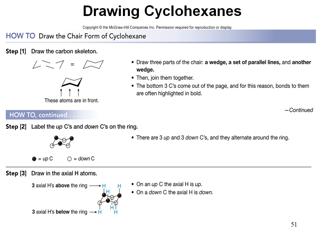
 These are not horrible slides, but they show too much information all at once. It is human nature for us to read everything that appears on a slide rather than listen to what the presenter is saying.
It is very easy to make an “animation” that gets across the same information without having an overwhelming amount of information projected on the screen at all times. Here is a short video that I have made showing how this same information can be imparted using very simple techniques in PowerPoint.
Obviously, in the classroom, we work our way through the information in a step-wise manner over a period of several minutes. Here I am just quickly clicking through the two slides. In the lecture, the students have been given a handout onto which they physically draw the chair form of cyclohexane as we progress through the “animation”. Drawing the cyclohexane chair may seem like an easy thing for students to do, but traditionally, mine do not seem to be able to make intelligible drawings without some guidance! While working our way through the “animation”, everything on the figure from the text is incorporated into the discussion plus we look at physical “ball and stick” models allowing the students to relate their drawing on paper to the three dimensional molecule.
Making this more interactive visual was not very difficult. If I can make something graphic, anyone can as I have little artistic talent! All that was required was to insert lines, boxes or circles using the shapes on PowerPoint’s drawing toolbar and then tell them when and how to appear and disappear using the animation toolbar and animation pane. Although it takes more time to make slides like this compared to just typing a list of bulleted items or using a stock figure from a text book, it is far more interesting and attention holding for your audience. With small bits of information appearing on the screen, students are less likely to quickly read what is on the screen and go back to their social activities like texting, tweeting, etc.
Most people tend to remember pictures better than paragraphs of words so I try to incorporate pictures as much as possible on my slides and use words somewhat sparingly so they have more impact when they do appear. If you want to give students more information, you can always provide them with a lecture outline or make presenter notes to share.