Branding Guide
Branding Guide
The Western Oregon University brand extends beyond logos and colors; it embodies our culture, mission, vision, values, and purpose. This brand is crucial in conveying who we are to students, alumni, and stakeholders globally. Understanding, embodying, reinforcing, and promoting our brand are essential steps to broaden our influence, enhance our reputation, and fulfill our mission.
Our logos and wordmarks are licensed trademarks. Those seeking to reproduce the signature or logos on promotional items, including apparel, must do so through a vendor licensed through our partners at CLC. Items printed and distributed by non-licensed vendors are in violation of trademark and copyright laws.
Boilerplate
Western Oregon University, established in Monmouth in 1856, proudly stands as Oregon’s oldest public university. Hosting around 4,000 students, Western embodies a mid-sized, NCAA Division II institution, with approximately 80% of its students hailing from within the state. Notably, its diverse student body comprises individuals from underrepresented backgrounds, veterans, and non-traditional learners. Western stands as the preferred campus in Oregon for those pursuing an enriching education within a nurturing, student-focused environment, characterized by faculty-led instruction. Where YOU Belong.
Overview
We place significant importance on its typefaces, colors, and logos, as they have been thoughtfully crafted to effectively convey our brand visually. When used in the correct manner, the university’s primary visual elements convey a consistent and distinct message. We kindly request that you adhere closely and accurately to these standards when producing branded content.
Logos
The Western Oregon University logos are the primary and most recognizable identifiers for our institution. In all print and digital communications, it’s crucial to include an approved university logo and adhere to the standards outlined below. To maintain the integrity of WOU’s identity, the logo must be consistently applied in all usages. For flexibility and to accommodate different design requirements and spaces, you may use any of the institutional logos. Any deviations from these standards must be approved by Marketing & Communications through the artwork approval form.
The full name of the university must be included on all imprinted merchandise. The Secondary Athletic Logo meets this requirement if space for the extra text, Western Oregon University, is limited.
For specific logo files and downloads, or to ask about licensing, contact marcom@wou.edu.
WOLVES WORDMARK
Main University Logo

TORCH WORDMARK
Academic University Logo

PRIMARY ATHLETIC LOGO

SECONDARY ATHLETIC LOGO

WOU WOLVES SHIELD

OPTIONAL LOGOS
The logos below must be accompanied by the name of the university.
OREGON WOLF

Example:

Colors
WOU’s primary colors, red and white, should be prominently featured as the dominant colors in all forms of communication and branding materials across various mediums. This consistency helps reinforce and strengthen the university brand identity. All WOU logos are available in three-, two- and one-color options.
 WOU RED (PMS 186)
CMYK: 0 100 81 4
RGB: 227 24 55
HEX: #DB0A29
 WHITE
WHITE
CMYK: 0 0 0 0
RGB: 255 255 255
HEX: #FFFFFF
 WOU BLACK
CMYK: 0 0 0 100
RGB: 35 31 32
HEX: #000000
 WOU GRAY (PMS 421)
CMYK: 0 0 0 26
RGB: 196 198 200
HEX: #C4C6C8
 WOU SILVER (PMS 877)
CMYK: 0 0 0 40
RGB: 167 169 172
HEX: A7A9AC
WOU Seal
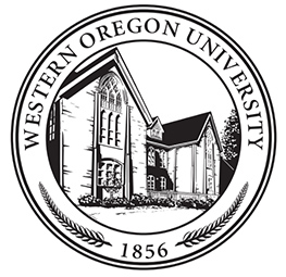 The WOU Seal features an illustration of Campbell Hall, which is the oldest building at Western Oregon University and among all Oregon public institutions of higher education. The seal also includes the university’s founding date, 1856. It is exclusively reserved for official use, such as certificates, diplomas, transcripts, medallions, and plaques. To ensure that the seal remains legible, it should not appear smaller than 3/4-inch in circumference when used.
Minimum Logo Sizes
All logos have a minimum allowable size. In order to ensure clear reproduction and legibility, the logos must not be used any smaller than the sizes shown below. It is preferred when possible the logos used larger than the minimum size allowed. Exceptions may be considered when creating a textile used to create a background pattern.
")
Safe Zones
Each WOU logo has a designated safe zone, which is essential to preserve the integrity of the logo and prevent visual clutter. For the Academic logo, it’s important to leave blank space around it that is equal to the height of the lettering in the word “university.” 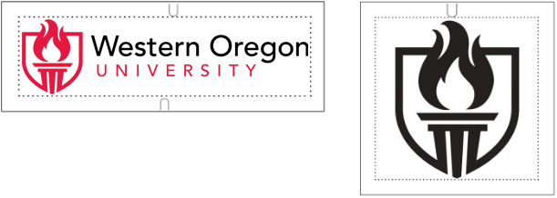 When using the shield component alone, make sure to maintain blank space at the top and bottom edges of the shield, creating a square dimension around the perimeter. Ideally, no other type or graphic element should encroach upon this safe zone. However, there may be exceptions for apparel and merchandise, but the safe zone should generally be respected for clear and legible logo presentation.
Western’s Typefaces
In all campus communication efforts, typography and fonts can unify materials and add another element that defines Western Oregon University’s look and voice. The university has adopted the following fonts, Minion, Avenir and Montserrat. Minion is a traditional serif font best suited for projects that are more formal, as well as for academic and educational projects and correspondence. This font is preferred for all university and general campus correspondence. Avenir is strong, yet neutral, contemporary san serif font. Monterserrat is similar to Avenir, but with a taller x-height and is considered readable and friendly, and both work well with the university’s established identity.
FONTS: San Serif

FONTS: San Serif
Used to create Wolves Wordmark

FONTS: Serif

WEB FONTS: San Serif

Athletic Typeface
In all campus communication efforts, typography and fonts can unify materials and add another element that defines Western Oregon University’s look and voice. Compatible fonts for Western Oregon’s athletic identity are WOU Bold and Bank Gothic. Bank Gothic is the font used in the banner text of the WOU athletic logos.
WOU Bold is a custom font designed to match the mascot logos and is available from MarCom.
Bank Gothic is the best font choice when typography is used near one of the athletic logos – exceptions may be considered for apparel and merchandise.
