Many of you may be shocked to know that letter addressing is rarely covered in schools anymore. Well, I’m pretty sure any faculty member that has graded papers before isn’t all that shocked, but I digress. Like cursive and checkbook balancing, the art of addressing a letter has fallen by the wayside. In this post, I will overview some of the important aspects of formatting an address correctly.
To keep things simple, this post will focus on the content of the address itself, rather than format or placement. First, I will outline what the post office’s official requirements are, and then I will tell you what my experience has been.
US Post Office official requirements for addressing
Domestic addresses should be left justified, in all caps (if typed) and formatted like this:
NAME/TITLE
(ORGANIZATION)
STREET ADDRESS OR PO BOX
CITY, STATE, ZIP CODE
Writing should be neat and easy to read, and if typed, the address should be in a simple font such as Arial, Georgia or Times New Roman.
My personal experience
This campus has sent out some incredibly diverse mailings, so I’ve gotten a really good feel for what works and what doesn’t. Caps and left justification are not nearly as important as simply being able to read what is written on the envelope. Here’s the breakdown of what I have found to be the most important factors in addressing an envelope.
- Color– Ink color should be only black or blue ink. Pencil is not recommended as it rubs off too easily, and different colors are often too hard to read. For instance, if your recipient’s address is purple, and your return address is black, the scanners will likely pick up the black before the purple and send it on back to you. Never use red ink in an address! It is the same color as the postage ink, and can often be overlooked by the machinery.
- Equally important is the color of the envelope. Dark printing on light paper is easier to read than light printing on a dark background. The color of the postal ink is red, so the envelope should not be dark enough to obscure it.

- Font or handwriting– I agree with the post office’s suggestion to choose a simple font. Although fancy scripts look beautiful and catch the eye of the recipient, they are not the most accurate means of communicating information. The same goes for handwriting; the easier it is for you to read the more likely that it will reach it’s destination in a timely manner
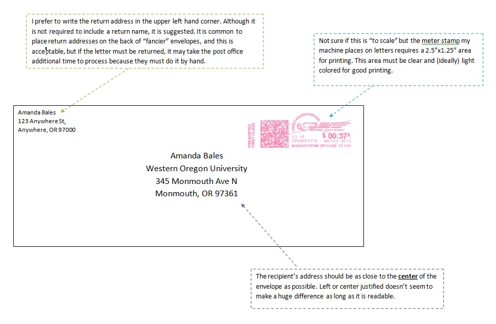
- Placement– This is incredibly important. As explained on my “How is Mail Processed?” page, your letter is passing under an automated scanner at speeds that rival NASCAR races. Even the slightest deviation from the norm can cause this scanner to throw a hissy fit (believe me, I’ve experienced it). The picture below is an example of the right way to address an envelope (click to see a larger version). For examples of what NOT to do and explanations of why, please visit my page “How NOT to send mail”.