1. US Post Office official requirements for addressing
According to the US Postal Service, domestic addresses should be left justified, in all caps (if typed) and formatted like this:
NAME/TITLE
(ORGANIZATION)
STREET ADDRESS OR PO BOX
CITY, STATE, ZIP CODE
Writing should be neat and easy to read, and if typed, the address should be in a simple font such as Arial, Georgia or Times New Roman. However, sometimes the post office doesn’t account for all contingencies, which is why I have included….
2. My personal experience
- Color– Ink color should be only black or blue ink. Other colors (including pencil) are not recommended. Never use red ink in an address! It is the same color as the postage ink, and can often be overlooked by the machinery.
- Color of the envelope- Dark printing on light paper is easier to read than light printing on a dark background. Again, never use red colored envelopes, because the color of the postage mark is red and would be obscured.

- Font or handwriting– I agree with the post office’s suggestion to choose a simple font. Fancy scripts may be fun and look beautiful but they are not the most accurate means of business communication. Similarly, handwritten addresses should be easy to read to ensure quick delivery.
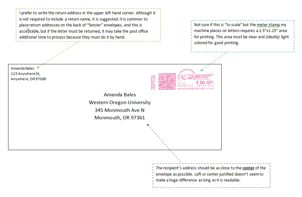
- Placement– This is incredibly important. The picture below is an example of the correct way to address an envelope. For examples of what NOT to do and explanations of why, please visit my blog page “How NOT to send mail: An obscure rant”.